

The fastest, reliable way to compare commute times across candidate addresses is combining isochrone maps with traffic-aware, multi-origin checks sampled during rush hours.. Run an isochrone first to screen neighborhoods by reachability, then narrow to your finalists and sample actual departure times at 7:15, 7:45, and 8:15 AM. Maps handle the broad search; sampling handles the truth about Tuesday morning traffic.
TL;DR:
- Combining isochrone maps with traffic-aware sampling provides the most accurate rush hour commute estimates, especially when checked at multiple times across different days.
- Conducting a step-by-step process from broad neighborhood screening to detailed per-address comparisons ensures reliable data and reduces tour fatigue.
- Precise measurement rules, including door-to-door time, parking, transfers, and timing consistency, are essential for fair commute comparisons.
- Using private, organized tools to record and compare commute data prevents memory loss and helps in making informed housing decisions.
Table of Contents
- What Are the Best Ways to Compare Commute Times?
- How Do You Run a Commute Comparison Step by Step?
- What Data Points Make Commute Comparisons Fair?
- How Do You Turn Commute Minutes Into a Housing Decision?
- A Compact Example You Can Reproduce
- How NestNoted Keeps Commute Testing Organized and Private
- Does Commute Time Actually Affect Health and Quality of Life?
- Which Tools Actually Compare Commute Times in Real Time?
- What's the Environmental Cost of Different Commute Modes?
- Why Reachability Beats Distance, and What Buyers Get Wrong
- Keep Every Commute Test Next to the House It Belongs To
- Sources
What Are the Best Ways to Compare Commute Times?
Three methods cover almost every commute comparison scenario, and each solves a different problem in the house hunt.
Isochrone maps draw a polygon around your destination showing everywhere reachable within a set travel time, by driving, transit, biking, or walking. Commute time maps are the right tool when you are still shopping neighborhoods and don't have specific addresses yet. Type in your office address, set a 30-minute driving limit, and the map shows every neighborhood inside that boundary. No guessing based on how far something looks on a map.
Multi-origin batch comparisons take over once you have a shortlist. Instead of one reachability blob, you get exact minutes for each specific address, side by side. This is where isochrones fall short: a neighborhood might sit inside your 30-minute polygon, but the specific house at the end of a cul-de-sac with one exit road could run 38 minutes at 8 AM.
Traffic-aware sampling answers the question both previous methods gloss over: what happens during actual rush hour? Traffic-aware commute analyzers pull historical traffic patterns and route multiple departure times, revealing the gap between a Sunday-afternoon Google Maps estimate and a Monday-at-8:05 reality.
Mode matters as much as method. Consider testing:
- Driving alone, including parking search time at the destination
- Transit only, factoring wait times and transfers
- Biking, where infrastructure quality varies wildly block to block
- Walking for genuinely close options
- Mixed mode (drive or bike to a transit stop, then ride the rest)
Combined trips often beat pure driving in congested metros, even when the total distance is longer.
How Do You Run a Commute Comparison Step by Step?
A repeatable process beats one-off spot checks, especially when you're touring five or six houses in a single weekend and the details start to blur together.
- Collect every candidate address plus your key destinations: primary job, a partner's job, daycare, a gym you actually use. Standardize the format (full street address, not "the blue house on Elm") so nothing gets mixed up later.
- Choose which modes to test. If you'd genuinely take transit two days a week, test it. Don't test bike commutes you'll never actually ride.
- Define your rush-hour windows. Morning is typically 7:00 to 9:00 AM; evening runs 4:30 to 6:30 PM. These windows shift by metro, so adjust for your city's actual peak.
- Run isochrone maps first to eliminate whole neighborhoods that fall outside your time budget. This step alone can cut a 20-house tour list down to eight.
- Run multi-origin batch checks on the survivors, getting per-address numbers instead of a shaded polygon.
- Sample three or more departure times across at least two different weekdays. A single Tuesday sample can mislead you if there was an accident or a school closing that day.
- Record the median, minimum, and maximum for each address and mode, not just one number.
- Estimate the monthly cost, in both hours and dollars, and fold it into a single comparison score alongside price and square footage.
Pro Tip: Sample Thursday and Tuesday mornings separately. Mondays skew light from holiday weekends and remote-work stragglers, and Fridays skew light from early leavers. Tuesday through Thursday gives you the truest read on typical traffic.
The whole workflow takes maybe 45 minutes per shortlist address, a small time investment against a decision you'll live with for years.
What Data Points Make Commute Comparisons Fair?
Comparing "22 minutes" against "25 minutes" is meaningless if one number is door-to-door and the other is curb-to-curb, or if one includes parking and the other doesn't. Fair comparisons require identical measurement rules across every address.
Capture these for every candidate, every time:
- Departure window and day of week, since Tuesday at 7:30 AM and Friday at 7:30 AM can produce wildly different numbers
- Door-to-door time, including the walk to your car or the transit stop, not just the driving or riding portion
- Parking search time and cost at the destination, which routing tools routinely ignore
- Transit transfer and wait time, plus how frequently the line actually runs (a bus every 8 minutes is a very different commute than one every 25)
- Minimum, median, and maximum across your samples, along with the share of trips that cross the 60-minute mark, since distribution tells you more than a single average
- Monthly time total, calculated as daily round trip times roughly 21 working days
- Planned disruptions, like scheduled road construction or a transit line expansion that could change the math within a year of moving in
Skip any of these and you're comparing apples to something that only looks like an apple on the surface.
How Do You Turn Commute Minutes Into a Housing Decision?
A median commute time tells you what a typical day looks like. The mean gets skewed by outliers, one bad accident day can drag an average up without reflecting reality. The full distribution matters most: a commute averaging 32 minutes with a tight 28-to-36 range is more livable than one averaging 30 minutes but swinging between 20 and 55.
Do the annual math before you decide anything. A 10-minute daily difference, 20 minutes round trip, adds up to roughly 87 hours a year. That's more than two standard workweeks spent in a car or on a train, every single year you live there. The national average one-way commute sits around 27.6 minutes, though major metros like New York average closer to 41 minutes, so even "typical" commutes in dense cities eat a real chunk of the calendar.
Weigh that time against hard costs: fuel, a transit pass, parking fees, and against softer costs like stress and how forgiving your job is about a late arrival; for a deeper dive into housing-cost tradeoffs, see the analysis on Renting vs. Tiny Homes. If you work from home three days a week, a longer commute matters less; if childcare pickup has a hard 5:45 PM deadline, commute reliability matters more than the average number itself.
A Compact Example You Can Reproduce
Picture three candidate addresses and one workplace. You're testing driving and transit, with a 7:00 to 9:00 AM window.
- Run an isochrone at a 35-minute driving limit first. One of the three addresses falls outside the boundary entirely, eliminating it without further work.
- Run multi-origin batch checks on the remaining two, sampled at 7:15, 7:45, and 8:15 AM across two different weekdays.
- Record the polygon result, each address's median, minimum, and maximum, plus parking or walk time on each end.
- Multiply the round-trip median by roughly 21 working days to get a monthly-hours estimate for each finalist.
Store all of it, screenshots, minute ranges, and your own notes about how the drive actually felt, in one private comparison table rather than scattered texts and browser tabs. That record becomes the thing you actually compare when it's decision time, not a hazy memory of "the one with the fast commute."
How NestNoted Keeps Commute Testing Organized and Private
Commute numbers are only useful if you can find them again next to the right house. NestNoted gives each property its own private entry where a commute test, a screenshot of an isochrone, and a note like "transit added 12 minutes of waiting" all live together instead of scattered across five browser tabs and a group chat.
That privacy matters more than it sounds. Competitive markets push buyers to tour fast and decide faster, and comparing five properties side by side, commute data included, cuts the mental load of trying to remember which house had the annoying left turn onto the highway. A private side-by-side comparison built for your own decision beats a shared spreadsheet where every note gets filtered through what you think the seller's agent might see.
Does Commute Time Actually Affect Health and Quality of Life?
A long commute isn't just lost time. It's a recurring stressor that touches sleep, exercise, and how much patience you have left when you walk through the door at 6:30 PM.
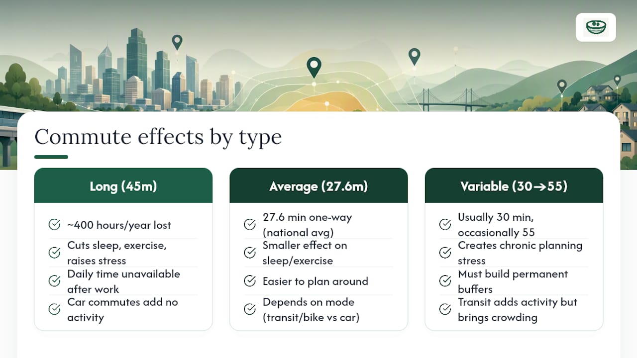
The math is unforgiving once you look at it in annual terms. Someone with a 45-minute one-way commute, well above the 27.6-minute national average, loses close to 400 hours a year to travel alone, time that isn't available for sleep, cooking, exercise, or just decompressing. That deficit compounds. Shorter sleep and less exercise both correlate with worse mood and higher stress, and a commute is often the single biggest daily time block competing directly against both.
Reliability matters as much as raw duration. A commute that's usually 30 minutes but occasionally spikes to 55 creates a different kind of stress than a steady 35 minute trip. You can plan around the second; the first means building in a permanent buffer that eats into your morning every single day, whether traffic cooperates or not.
Mode changes the equation too. Transit and biking commutes often build in light physical activity that a car commute doesn't, while a packed rush-hour train has its own friction: crowding, delays, standing the entire ride. None of this shows up in a simple "22 minutes" estimate, which is exactly why sampling and mode testing matter more than a single quoted number from a map app.
Which Tools Actually Compare Commute Times in Real Time?
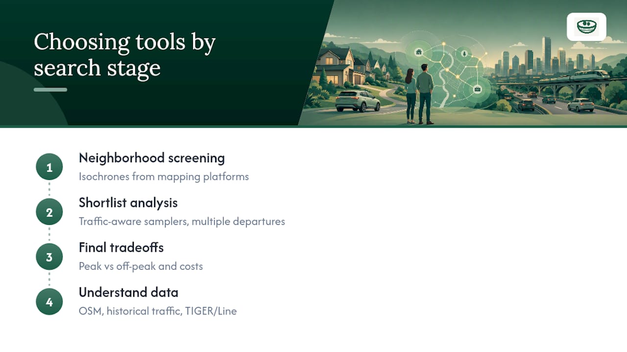
Real-time and traffic-aware tools split into a few categories, and knowing which one fits your stage of the search saves a lot of wasted clicking.
Mapping platforms that generate isochrones are the right starting point for neighborhood screening, showing reachable areas by mode without requiring you to already have addresses picked out. Once you have finalists, traffic-aware analyzers that sample multiple departure times give you the rush-hour truth, including best-case, worst-case, and typical numbers rather than one optimistic estimate. Some commute tools go further, layering in peak versus off-peak comparisons and monthly cost estimates alongside the raw minutes, which helps when you're weighing a faster but pricier commute against a slower, cheaper one.
Most of these tools rely on similar underlying data: routing engines built on open mapping data like OpenStreetMap, combined with historical traffic patterns and, for broader city comparisons, government datasets like the Census Bureau's TIGER/Line geographic files. Knowing the data lineage helps explain why two tools sometimes disagree by five or ten minutes on the same route. Different routing assumptions, different traffic-sample windows, different definitions of "typical."
The practical move: use a mapping tool for the wide screen, a traffic-aware analyzer for the shortlist, and don't trust a single number from either without at least a couple of departure-time samples behind it.
What's the Environmental Cost of Different Commute Modes?
Commute mode is a daily, repeated choice, which means small differences per trip compound into large differences per year. A solo car commute has the highest per-mile footprint of common commute modes, and that gap widens further in stop-and-go traffic, where fuel efficiency drops sharply compared to steady highway speeds.
Transit shifts the math because the emissions get spread across many riders instead of one, particularly on routes that run at high occupancy during peak hours. A half-empty bus at 10 PM looks inefficient; the same bus packed at 8 AM looks very different. Biking and walking carry essentially no operating emissions, though infrastructure quality (protected bike lanes, sidewalk coverage) determines whether they're realistic options rather than theoretical ones.
Mixed-mode trips, driving or biking to a transit stop, then riding the rest, often deliver a practical middle ground: shorter door-to-door time than pure transit, lower emissions than driving the whole distance. If you're weighing two similar houses and one supports a mixed-mode commute while the other locks you into solo driving, that's worth factoring in alongside the raw minutes, especially if long-term fuel and maintenance costs matter to your household budget the way a utility cost comparison does for a home's monthly expenses.
Why Reachability Beats Distance, and What Buyers Get Wrong
The biggest mistake in commute research isn't skipping the analysis. It's trusting a single number. A map app tells you 24 minutes at noon on a Sunday, and that number quietly becomes gospel, even though it has nothing to do with a Tuesday at 8 AM.
Conventional house-hunting advice treats commute as a distance problem, "how many miles to the office," when it's actually a time-reliability problem. Two houses at identical mileage can produce commutes that differ by 15 minutes depending on road structure, traffic light timing, and transit frequency. That's the entire case for isochrones over straight-line distance: they measure actual reachability, not geometry.
The second mistake is testing once and calling it done. Sampling multiple departure times reveals variance that a single check hides completely, and variance is often the thing that actually wears you down over a year, not the median itself.
What should come first: run the reachability map before you fall in love with a neighborhood, sample real departure times before you fall in love with a specific house, and write down what you find somewhere private, so the fourth house doesn't erase your memory of the first.
— Antony
Keep Every Commute Test Next to the House It Belongs To
Commute research generates real data, screenshots, minute ranges, parking notes, and that data is only useful if it survives past the weekend you collected it. A personal property management tool gives every property its own private card where commute findings sit alongside your other impressions, so nothing gets lost between the fifth and the eighth house you tour.

Log your isochrone screenshots and batch-check results directly against each address, then pull up a side-by-side comparison when it's time to decide. Shared workspaces let you and your agent compare notes on the same offer tracking page without anything going public, and the built-in AI assistant can surface which properties had the shortest recorded commute the moment you ask. Start a free account and log your first commute test before your next tour.
Sources
- Commute estimator — MoveNumbers
- Travel time map & drive time map maker — TravelTime
- CommuteGraph — Visualize commute times
- TIGER/Line Shapefiles — U.S. Census Bureau
- Time to Commute - U.S. city commuting maps — GeoTab