

A home comparison chart is a side-by-side evaluation tool that organizes key property attributes and financial metrics so buyers can make informed decisions without relying on memory or gut feeling alone. The standard industry term for this practice is comparative property analysis, though most buyers and agents simply call it a house comparison chart or home comparison worksheet. Used correctly, this tool cuts through the noise of touring dozens of homes and forces you to evaluate each property on the same criteria. Nestnoted is built around exactly this kind of structured, private tracking for serious buyers.
What should your home comparison chart include?
Before you build your chart, you need to gather the right data. Missing even one category, such as HOA fees or property taxes, produces a skewed comparison that can cost you thousands after closing.
Essential property details to collect for each home:
- Address and listing price
- Number of bedrooms and bathrooms
- Square footage (interior) and lot size
- Year built and property condition
- School district and commute distance to your workplace
Financial factors that must appear in every row:
- Monthly property taxes (annualized, divided by 12)
- HOA fees (monthly)
- Estimated homeowner's insurance
- Estimated monthly mortgage payment at your target rate
- Estimated maintenance reserve (typically 1% of purchase price per year)
Personal priority categories:
- Non-negotiable needs (deal-breakers if absent)
- Strong wants (important but flexible)
- Nice-to-haves (bonus features that do not drive the decision)
Industry standards recommend comparing 2 to 4 properties side by side for clarity and effectiveness. Exceeding four properties in one chart creates information overload that slows decisions rather than supporting them.
Pro Tip: Limit your active shortlist to 3 properties at a time. When a new home enters your list, drop the weakest performer. This cycling method keeps your chart focused and your thinking clear.
How do you build and fill out a home comparison chart?
The most effective property comparison tools combine objective financial data with weighted scoring to reduce emotional bias. Here is how to build one that actually works.
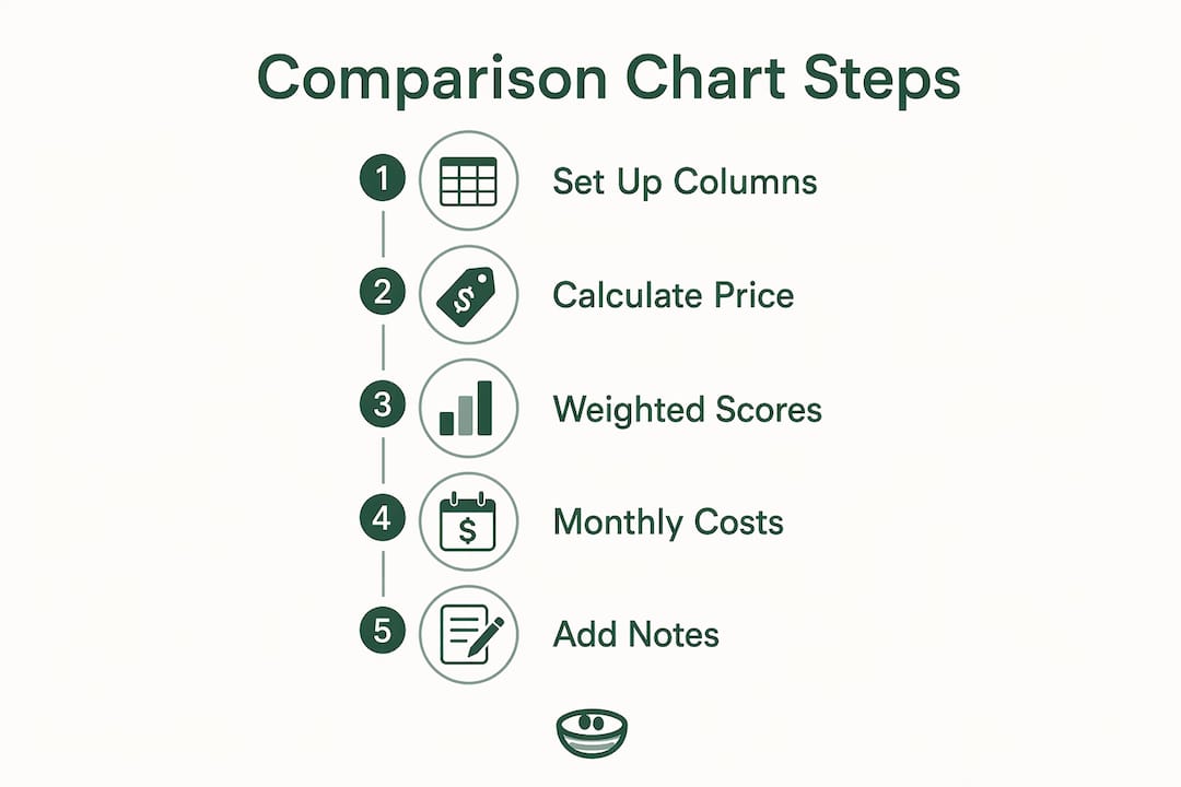
1. Set up your columns and rows
Create one column per property and one row per attribute. Label the first column "Category" and add a column for each home. Use consistent field names across every property so you are always comparing the same thing.
2. Calculate price per square foot
Price per square foot is the core normalized metric for comparing homes of different sizes. Divide the listing price by the total interior square footage. A 1,800-square-foot home listed at $360,000 costs $200 per square foot. A 2,200-square-foot home at $418,000 costs $190 per square foot. That $10 difference per square foot reveals which property delivers more space for the money, even when the sticker prices look similar.

3. Add a weighted scoring system
Classifying each feature as a deal-breaker or nice-to-have and scoring it on a 1–5 importance scale sharpens logical selection. Assign each category an importance weight from 1 (low priority) to 5 (must-have). Then score each property from 1 to 5 on how well it meets that criterion. Multiply the weight by the score to get a weighted result. Add up the weighted results for a total match score per property.
4. Calculate estimated monthly costs
A financial comparison worksheet covers total purchase price, estimated monthly mortgage, and upfront costs as the three foundational data points for first-time buyers. Add HOA fees, property taxes, and insurance to your mortgage estimate to get a true monthly number. Two homes with similar list prices can differ by $400 or more per month once all costs are included.
Here is an example of what a filled-out chart looks like for three properties:
| Category | Home A | Home B | Home C |
|---|---|---|---|
| List price | $385,000 | $410,000 | $375,000 |
| Sq. footage | 1,900 | 2,100 | 1,750 |
| Price per sq. ft. | $202 | $195 | $214 |
| Bedrooms / baths | 3 / 2 | 4 / 2.5 | 3 / 2 |
| Monthly mortgage est. | $2,050 | $2,180 | $1,990 |
| Property taxes (mo.) | $310 | $380 | $290 |
| HOA fees (mo.) | $0 | $150 | $75 |
| Total monthly cost | $2,360 | $2,710 | $2,355 |
| Weighted match score | 38 | 44 | 31 |
5. Add a notes section
Reserve the bottom row of each column for open-ended impressions. Write down anything the numbers do not capture: the smell of moisture in the basement, the noise from a nearby highway, or the unusually well-maintained backyard. Side-by-side comparison charts highlight differences immediately, but subjective notes fill the gaps that raw data misses.
Pro Tip: Save your chart as a shared document or in a dedicated tracking tool like Nestnoted so you can update it after every tour. Memory fades fast. Notes taken the same day are far more reliable than recollections from a week later.
What mistakes do buyers make when comparing homes side by side?
Most comparison errors fall into predictable patterns. Knowing them in advance keeps your chart useful instead of confusing.
-
Comparing too many properties at once. Keeping a shortlist to no more than 4 properties prevents decision paralysis. When buyers load 8 or 10 homes into one chart, the data blurs and the tool stops working.
-
Ignoring hidden ownership costs. Including HOA fees, property taxes, maintenance, and insurance normalizes true cost comparisons between properties. A home with a $20,000 lower list price can cost more per month once HOA fees and higher taxes are factored in.
-
Relying only on financials. Numbers alone do not capture whether a neighborhood feels right for your family or whether the layout works for how you actually live. Weighted scoring for personal priorities corrects this imbalance.
-
Mixing incomparable property types. Putting a studio condo and a four-bedroom single-family home in the same chart produces meaningless comparisons. Keep your chart focused on properties that serve the same purpose for your household.
-
Forgetting to update the chart. A comparison chart reflects the moment you filled it out. Prices change, new listings appear, and your own priorities shift. Review and update your chart at least once a week during an active search.
-
Skipping neighborhood factors. School ratings, commute times, walkability scores, and proximity to amenities belong in the chart. A home that scores well on price and size but sits in a poor school district may not serve a family with children.
Pro Tip: Write your top three non-negotiable needs at the top of your chart before you add a single property. Any home that fails even one of those needs gets removed immediately, no matter how attractive the price.
How do investors and home buyers differ in their comparison approach?
The best metric for comparing homes depends entirely on your goal. Investor-focused charts emphasize financial returns, while buyers emphasize monthly costs and livability factors. This distinction shapes which rows you weight most heavily.
| Comparison category | Home buyer priority | Investor priority |
|---|---|---|
| Monthly total cost | High | Moderate |
| School district quality | High | Low |
| Cap rate | Low | High |
| Gross rental yield | Low | High |
| Cash flow (monthly) | Low | High |
| Commute distance | High | Low |
| Price per sq. ft. | Moderate | Moderate |
| Neighborhood livability | High | Moderate |
A buyer searching for a primary residence weights school quality, commute time, and layout heavily. An investor weights cap rate, projected cash flow, and price relative to rental income. Both use the same chart structure, but the importance scores assigned to each row look completely different. Effective comparison tools combine objective data with weighted scoring to strip emotional bias and quantify priorities, which is why the same framework works for both buyer types when customized correctly.
Investors should also add rows for estimated rental income, vacancy rate assumptions, and projected annual appreciation. Buyers rarely need these rows, but investors who skip them are comparing properties without the metrics that actually drive returns.
Key Takeaways
A structured home comparison chart that pairs financial data with weighted priority scoring is the most reliable way to make a confident, bias-free property decision.
| Point | Details |
|---|---|
| Limit your shortlist | Compare no more than 4 properties at once to avoid decision paralysis and keep evaluations clear. |
| Include all ownership costs | Add HOA fees, taxes, insurance, and maintenance to reveal the true monthly cost of each home. |
| Use weighted scoring | Rate each feature by importance (1–5) and multiply by property score to generate an objective match total. |
| Separate buyer and investor metrics | Buyers prioritize livability and monthly cost; investors prioritize cap rate, cash flow, and rental yield. |
| Update the chart regularly | Refresh your comparison after every tour and whenever a listing price or your priorities change. |
Why I think most buyers use comparison charts the wrong way
Most buyers treat a home comparison chart as a final verdict. They fill it out, see which property scores highest, and expect the decision to make itself. That is not how it works, and expecting it to work that way leads to frustration.
The chart is a thinking tool, not a judge. Its real value is in the process of filling it out. When you sit down to assign importance weights to school districts, commute times, and square footage, you are forced to articulate what you actually care about. That clarity is worth more than the final score.
I have seen buyers with a clear chart winner still feel uncertain, and that uncertainty is data. It usually means a priority they did not quantify is pulling them toward a different property. The right response is to go back to the chart, add that missing factor, and re-score. The chart should evolve as you learn more about what you want.
The other mistake I see constantly is treating the notes section as optional. Numbers normalize properties. Notes humanize them. A home that scores 42 out of 50 but has a note reading "felt dark and cramped in the main living area" is telling you something the spreadsheet cannot. Read your notes as carefully as you read your totals.
Revisit your chart after every two or three tours, not just at the end of your search. Your priorities will shift as you see more properties. A chart built in week one of your search rarely reflects what you know by week four.
— Antony
How Nestnoted supports your property comparison process
Tracking multiple listings across weeks of touring is where most buyers lose clarity. Notes get buried in text threads, spreadsheets go stale, and the details that mattered on day one are forgotten by the time an offer is due.

Nestnoted is built for exactly this problem. It gives buyers a private, organized space to track listings and impressions across every property they tour, with fields for financial details, personal notes, and offer history. All notes stay confidential by default, so you can record honest reactions without worrying about public visibility. Whether you are a first-time buyer managing a shortlist of three homes or an investor tracking a dozen properties across multiple markets, Nestnoted keeps your comparison process structured and your thinking clear.
FAQ
What is a home comparison chart?
A home comparison chart is a side-by-side table that organizes key property attributes and financial metrics for multiple listings. It helps buyers evaluate homes on consistent criteria to make informed purchase decisions.
How many homes should I compare at once?
Industry standards recommend comparing no more than 4 properties at a time. Exceeding that number causes information overload and slows decision-making.
What financial data belongs in a house comparison chart?
A complete financial comparison includes list price, price per square foot, estimated monthly mortgage, property taxes, HOA fees, insurance, and a maintenance reserve. These data points reveal the true monthly cost of ownership beyond the sticker price.
How does weighted scoring work in a property comparison chart?
Assign each feature an importance weight from 1 to 5, then score each property on how well it meets that feature. Multiply the weight by the score and total the results. This method strips emotional bias and produces a quantified match score for each property.
How is an investor's comparison chart different from a buyer's?
Investors weight cap rate, cash flow, and rental yield most heavily. Buyers weight monthly cost, school quality, and commute distance. Both use the same chart structure but assign very different importance scores to each category.